The Importance of Good Thumbnails and How to Make Them
They can make or break the performance of a video.
Estimated reading time: 5 minutes
By now, and especially if you’re in any way connected to the YouTube community, we all know that “don’t judge a book by its cover” is an obsolete piece of advice. Thumbnails – YouTube’s “covers”, along with titles – are the first thing that people see and many times, the only variables that they consider when deciding whether or not they will watch a video. This post is all about why you should care about how viewers might judge your thumbnails and how to get them up to scratch in order to make the most out of your content.
The Context
Let’s put ourselves in the shoes of a YouTube user for a while, so that we can understand what is important to your audience. The first thing that we need to be aware of is that YouTube is the second largest search engine in the world. That means there is A LOT of data there, in the form of videos, of course. The way videos are “packaged” is titles and thumbnails. So a huge part of what you’re going to choose to spend your time watching will depend on how attractive the thumbnail is.
Now, the attractiveness of it varies according to the niche or the intended audience. For example, what makes a good thumbnail for an educational channel about physics for beginners will most certainly be quite different from what a kids’ channel might require. In both cases, you want it to catch the viewer’s attention quickly and directly – but while that might mean bright colors and attractive shapes for children, for adults interested in physics, you would do better to choose a couple of keywords and stick to a recognisable brand aesthetic.
So we know that what goes into a good and efficient thumbnail varies according to the specific niche that it belongs to but there are still some broad guidelines that should always guarantee you’re using honey for your bees instead of vinegar.
General Rules
Customize your thumbnails: the first thing you should keep in mind when it comes to your thumbnails is that they should be instantly recognizable as yours. No matter the content, the “form” should have some constant elements in it that brand it as uniquely yours (maybe a color frame, a certain font, a filter or anything else you can think of). This is going to act as an instant cue for new viewers to keep watching your videos instead of someone else’s.
Bonus tip: showing your face on your thumbnails instead of using stock photos goes a really long way to making them more accessible and attractive to click on.

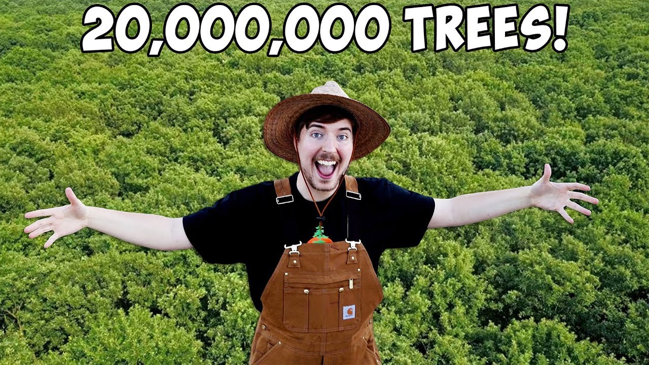
MrBeast’s thumbnails are instantly recognizable thanks to both him being on them (instead of just stock images) and the simple white font with a thin, black stroke.
Be honest: we know how tempting it is to go for the most shocking part of the video and showcase that in the thumbnail (even if it’s actually only 2% of the video). And it might work the first couple of times that a viewer clicks on your video, but as time goes on and they realize that they can’t trust your thumbnails to tell them what they will find in the video, your views/subscribers will start to drop. Being honest about what is in your video (with the help of a little hyperbole, why not?) is the better strategy, all things considered.
Keep text simple: words are one of the best ways to describe your video’s proposition, but when it comes to thumbnails, less is undoubtedly more. First of all, consider the visual aspect of the thumbnail and the amount of graphic information you are already providing: if you have more than one person, a busy background, added graphic elements, then more than one or two words will more likely confuse your viewer and make it harder for them to see what you’re trying to say. The best rule to follow is to keep it simple and try not to have more than 2 or 3 big elements to it (e.g.: one person, text, pop up). Another thing to consider is that a lot of people consume YT videos on their phones, and with that comes a huge reduction in scale. So if your thumbnail looks busy on a computer screen, it will only be even harder to decipher on a smaller screen.
Bonus tip: stay away from fancy fonts! The one place where fancy fonts don’t work is thumbnails – they need to be super easy to read.

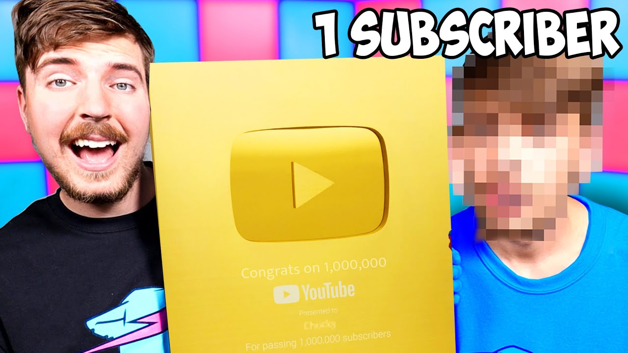
It doesn’t get simpler than a number and a word – this thumbnail is incredibly efficient at getting the message across through the symbolization of the people and things that are featured in the video thanks to his face, the golden YouTube button and the short text.
Mind the right side: remember that YouTube adds the length of the video on the bottom right-hand side of the thumbnail and the “watch later” and “add to queue” options on the top-right corner as well. The latter two only come up if you hover over the thumbnail, so be especially mindful of the bottom-right corner. This doesn’t mean that you can’t have anything in those areas, just that it’s a good idea that it’s nothing too vital that would be covered up by icons.
Consider and research your key-words: think of who your audience is, what peaks their interest and why they come (or should come) to you for that kind of content. It also does not hurt to have a look at what your peers are currently doing and what keywords are the most popular at the time of posting. You can use all of that information to choose a few, select words to include in your thumbnail that will give you the most chances at high views.
Be bold: Since thumbnails, by definition, are already quite small and yours will be competing with other surrounding ones, make sure to have easily and instantly recognizable elements to your thumbnail, whether it’s your facial expression, any graphics or, as we have covered already, any text. Pay special attention to the size of your elements and the contrast of colors.

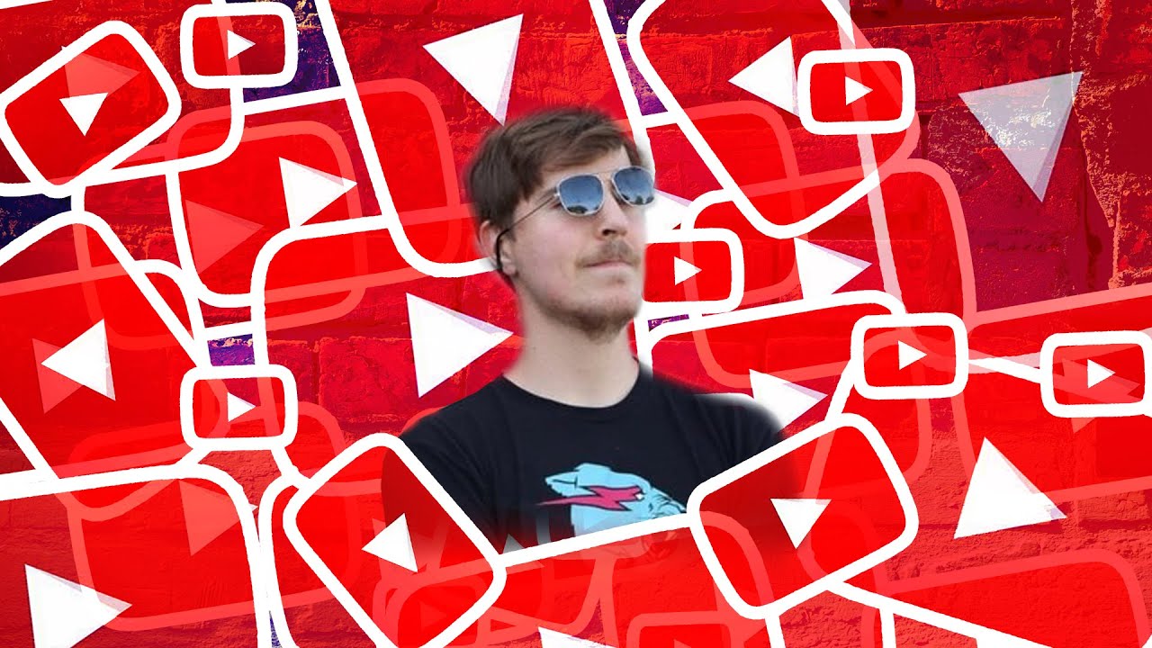
There really are only 2 elements to this thumbnail: MrBeast’s face and the YouTube logo, an ode to simplicity and boldness
So there you have it – these are the most important guidelines to keep in mind when making thumbnails. And now that we got all the rules out of the way, all that’s left is the fun part: apply your own style to it and do it your way!
If you’re in need of some extra help or guidance when it comes to your thumbnails, email us at [email protected] to know what we can bring to the table.
Tags: Thumbnails, Editing, YouTube, Creator
